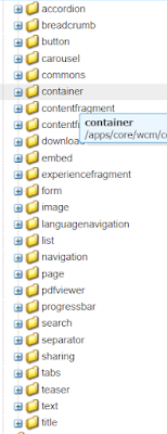
Components are basic building blocks of a websites, everything in AEM is a component.
Let’s assume to show any new content then we need to add a component on to the Page and edit the component by clicking on Wrench icon. Without components, we cannot create the content.
Components contain the dialog and that can contain any of the below fields.
- Path Browser (To Select Internal Pages,Images,etc.,)
- Select DropDown (Used for Selecting the Values)
- TextArea
- TextField
- Numberfield
- RichText
- Image
- Checkboxes
- Radio buttons
- Image/Fileupload
- Date Picker
- TagPicker
- MultiField
Below are the default components available in OOTB(out of the Box).
Styles:
Styles are used for Dynamically changing the single component to multiple variations like align Text to left,Right,Center. For each component styles will be available with painter icon just beside the wrench icon. Below is the example of styles.


Comments
Post a Comment